Nordea Markets
Identity design and brand guidelines for Nordea, the leading investment bank in the Nordic and Baltic Sea Regions.
BACKGROUND:
Nordea Markets, the leading capital markets operator in the Nordic and Baltic regions, is a branch of Nordea, the biggest bank in Northern Europe. The organization serves 11 million customers and consists of roughly 2,200 people. In 2013, they chose Snask to help them shape the very essence of the Nordea Markets brand within the existing parent brand of Nordea. The also enlisted us to help them tackle a hard but exciting task: to make an investment bank look sexier.
THE CASE:
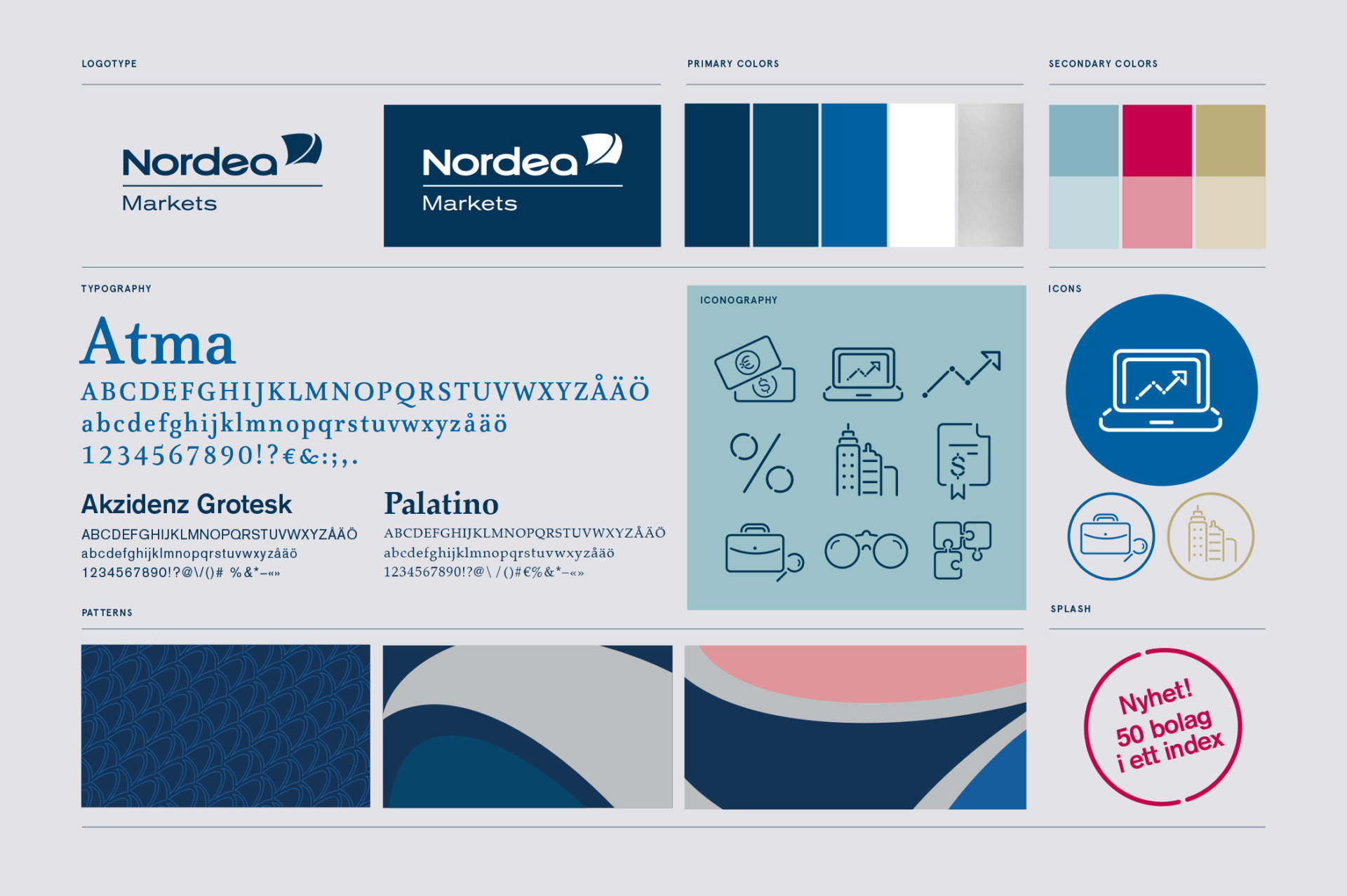
We wanted to give Nordea Markets a design that would make its personality known. Not only should it look, act, and feel like a leading player, but it should be ambitious, humble, and personal while doing so. To make the brand to stand out in the existing parent brand environment as well as the external competition, we devised two systems: The Brand Identity Guidelines and Tonality Guidelines. These standards spell out the guidelines for typography, iconography, brand colors, and copy. Setting the stage for Nordea Markets to enter as a brand that always puts customers first and avoids American corporate lingo. Since our relationship started in 2013, we have helped to define the brand’s hierarchy, write a brand story and all key messages for different target groups, deliver designs for the brand’s complete graphic identity, as well as produce branded material for print, digital, events and film environments. We are Nordea Markets’ agency of record, and we’re continuously working with them to implement their new brand direction in different mediums, anchored by their unique message: “We’ll help you grow.”
Still life photographer: Carl Dahlstedt