Kaibosh
Branding, identity and interior design concept for the Norwegian eyewear brand Kaibosh.
BACKGROUND:
Norwegian eyewear company Kaibosh contacted Snask because they felt that they had become too boring as opposed to what they should be: a trendy and bold eyewear brand. They felt their identity was too clean and they wanted to be more expressive and outgoing. The fashionable contender would finally get a makeover as well as a lovely new voice. We got the assignment to keep their existing logotype, but develop their new brand attributes ranging from signs, ads, packaging, bags, and posters. We also designed the look and feel of their entire flagship store.
THE CASE:
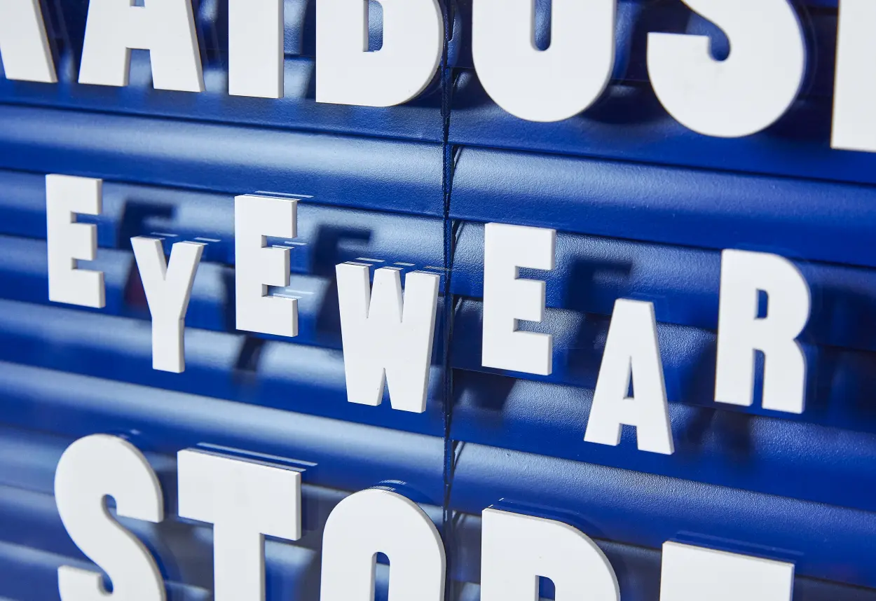
We started out writing their brand platform and tonality to incorporate much more copywriting in their communication, from promotion material to the walls in their stores. The brand and tonality was then translated into visual form to align with a custom-made display typeface, Sentrum, which suited the in-store signage. We designed two eyelashes as a symbol to distinguish the identity and use as a graphic element for many different touch points. We created the entire flagship store with shelving systems, signage, colors, murals, etc. The project’s scope was expansive: from typeface and still life photos to campaigns, fashion-photography, notebooks and towels. Now, people see Kaibosh with eyes wide open.


