Lensway
Design, rebrand & original films for Lensway, one
of Europe’s leading retailer of lenses and eyewear.
BACKGROUND:
Founded in 2000, Lensway has grown to be one of Europe’s largest retailer for lenses and eyewear. After a quick growth spurt, the brand quickly lost sight of its brand vision, and the company found itself left with a huge customer base, but one lacking in loyalty. Lensway realized the brand lacked the personality and signature tone of voice necessary to connect with their customers in a more human way. Snask won the assignment to modernize Lensway, creating a brand that had its own unique style and followed the beat of its own drum.
THE CASE:
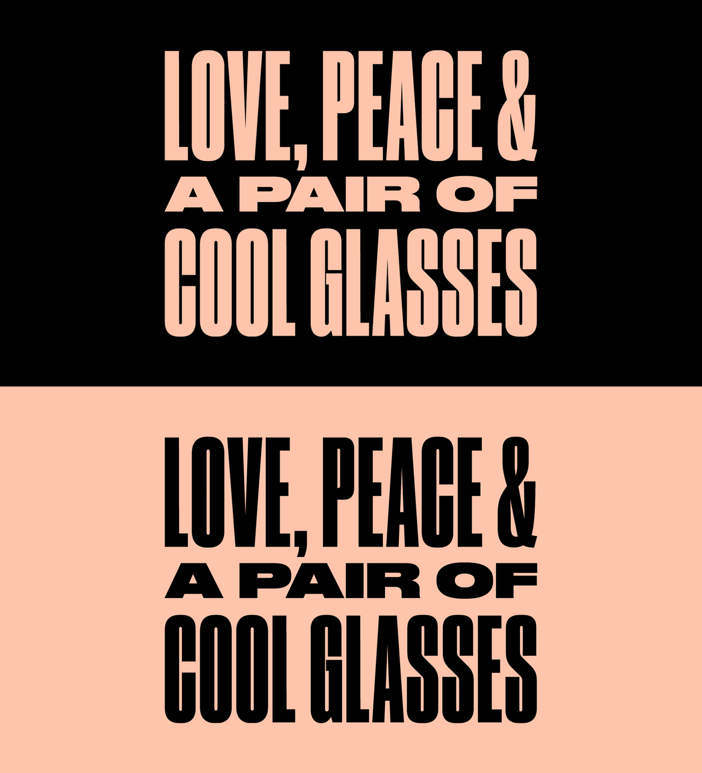
It was clear: for Lensway to be seen, it needed a visual overhaul. Everything, except the trusted and recognizable logo, was up for grabs. Snask focused first on “the windows to a person’s soul,” the eyes. Using the eye symbols in both the iconography and patterns, Lensway is able to grab people’s attention right away, while (literally) adding a human element to the brand. Snask chose typography that was versatile, playful and unique, yet easy to read. We also created a lexicon of icons that would help people navigate towards eyewear, sunnies, or contact lenses, with supporting icons that could extend into the online shopping experience. We decided to intensify the classic Lensway red by adding an equally strong electric blue with a calming peach-pink. This introduced a modern color pallet to the brand, which makes buying lenses and eyeglasses a party again! These color choices also gave the brand’s quirky statements, such as “Eyes are never quiet,” a specific tone that was relatable, cool, and perfectly offbeat. Along with the identity, we also art directed photography and original films for both online and on television. Lensway’s new design is a celebration for the eyes, and heralds the brand’s mission that “Good vision should be a right for everyone.”
Music by Darwood Music


